


If you’re not catering for mobile customers, you’re losing sales
Did you know that 87% of shoppers search for products on a mobile device before they buy? Mobiles are such an important tool in our lives, but many businesses don’t have a mobile responsive website design. When customers view these websites on a mobile or tablet, the website is hard to use. Text is tiny, buttons are hard to click and people have to pinch and zoom, which is annoying.
Mobile users expect access to everything at their fingertips. So if your website isn’t set up to capture customers at the moment they want to buy, you’ve lost your chance. They’ll simply bounce off your website with one click of the Back button, and choose the next website down the list.
Mobile responsive website design is becoming more important than ever. With Google’s mobile first indexing, non-responsive websites are being pushed down the rankings, and that’s terrible for your website traffic and sales.
Here, we’ll explain everything you need to know about responsive website design, and why it’s critical to your business, in non-technical language. Let’s go.
What is mobile responsive website design?
These days, people expect to browse products, checkout and pay on their mobile and tablet. They expect websites to be easy to use on a mobile, because they want answers right now, from the device that’s in their hand. If they have to switch devices to buy from you, you’ve lost them.
Responsive website design means:
- Websites look good and are easy to read on any size device
- The website design automatically adjusts itself to suit the device screen size
- Text fits and is a readable size on the screen without pinching or zooming
- Customers can click buttons with their fingers; buttons are not too small or close together
- The page loads quickly on a mobile data connection

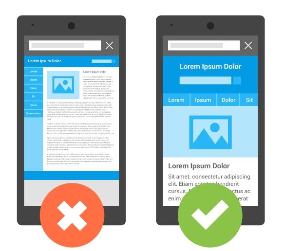
You can see in the image below that this website looks different on the desktop monitor, tablet and mobile. The branding elements, logo, colours and images are all the same, but the layout and menus are different, to suit the screen sizes. You’ll also notice that the desktop version is a landscape format (wider than it is tall) and the tablet and mobile versions are portrait (taller than they are wide), because that’s how we hold those devices.
This responsive website design of KDF BookkeepingServices knows what kind of device a visitor is using, and automatically adjusts itself to fit the device.

How can I check if my website is responsive?
Google has a Mobile Friendly Test. Type in your website URL and it gives you a review:

The mobile friendly test also tells you if there are any issues, like website items that didn’t load correctly, link text that is too small or buttons that are too close together.
Some “mobile friendly” websites are still hard for people to use. The website may pass the objective mobile friendly test, but the mobile site is ugly and doesn’t maintain the brand’s style or images. It’s not a nice customer experience shopping like this, so a lot of customers will abandon their search here.
Even after your website has satisfied Google’s test, the website still needs to pass a human usability test.
One easy way to check is to open your website on a mobile and a tablet and try to perform a few functions, like fill in a contact form or buy something through your eCommerce platform. Better yet, ask your mum or a friend outside your business to do the test and see what they experience. If you (or they) find it difficult, your website design needs to be improved to make it easier for customers to use.
What are mobile responsive design features?
Most importantly, you want a responsive design that makes it easy for customers to engage with your website on any device. Think about the actions you want people to take on your website such as understand which services you offer, read a blog post, browse and buy an item through a checkout, or call you to make an appointment. If a customer finds it difficult or fiddly to perform any of these actions on a tablet or mobile, you need a better responsive website design.
These are the responsive features that all customers now expect:
- Responsive eCommerce website design for online shopping
- Tap to dial a phone number on mobile devices
- Single tap to open a draft enquiry email in the user’s default email provider
- One click on Find Us to open Google Maps, with the destination pre-set into the directions field
Responsive features that make life easy for you are:
- When you update your website content in your CMS, the changes automatically appear on all devices: desktop, laptop, tablet and mobile
- More leads through your website as new customers will find it easy to use
- Reduced website hosting cost, as you are only hosting one responsive website - not a desktop version and a mobile version
What is mobile first indexing, and why is it important to my business?
With so many people using Google Chrome to search on mobiles, it should be no surprise that Google places high importance on responsive website design.
From July 2018, Google started penalising websites that were not mobile friendly. This means that mobile responsive websites achieve higher rankings in search results, and non-mobile friendly websites are pushed down the rankings.
Google is doing this because they understand how people use their mobiles to find information.
Think about how often you grab your mobile to look up “Italian Restaurant in [Suburb]” or “store opening hours for [retail business]” or “petrol near me.” This type of location-based search is very important on mobile. That’s why Google won’t show your results in a high-ranking position if your website isn’t mobile friendly.
Even for non-retail businesses, people search for all kinds of things the moment they think of it. Find information to answer a question, search for a How To video, look up an e-book review, make a booking for a hairdresser: no matter what your website offers, it’s critical that you have a mobile responsive design because your customers want to use their mobiles.
Your customers are also viewing your website on their mobile or tablet from their couch. They want to be comfy and search for information or products where they are, on the device that’s in their hand. So if your website isn’t responsive and difficult to use, they’d rather find the answer on someone else’s website rather than get up to switch to a laptop.
If my website isn’t mobile responsive, what am I missing out on?
Most importantly, your customers are frustrated every time they view your website. The text is too small so they have to pinch and zoom in to read, and the navigation links are so tiny and close together that they can’t hit them first time. They’re giving up, and going elsewhere. You’ve lost that customer.
And that’s if they even get to your website. With Google’s mobile first indexing, your non-mobile responsive website is being penalised, which means it’s less likely to show up in search results.
If you’re running two versions of your website
Every update you make to one website has to be made to the other, which is double handling. By combining your desktop and mobile websites into a single responsive website design, you’ll have one coherent brand message and only one website to maintain, host and update.
Know your visitor statistics
Your website visitor statistics can give you valuable information about your customers.
If you’ve got a Google Analytics account, or another CMS plug in that shows your website traffic, it’s capturing a lot of useful data that you can learn from.
Your website analytics shows you:
- Your website traffic over a time period (how many visitors per day, week, month)
- Which devices your visitors are using (desktop, laptop, tablet, mobile)
- Which operating system your visitors are using (Android, iPhone, iOS, Windows etc)
- Percentage of visitors that are new or returning to your website
- How many pages visitors look at in each session
- Which country and city your visitors are from
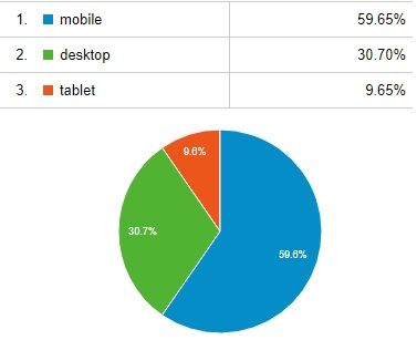
The above graph shows the ratio of desktop (including laptop), tablet and mobile visitors on out website. If your website isn’t responsive, you’re making it hard for all those people on tablets and mobiles to become your customers.
How can I get a mobile responsive website design?
If you’ve had your current website for a few years, the website probably can’t be made into a responsive design at the flick of a switch.
The good news is that most new website templates and themes are mobile responsive by default. And so they should be, since responsive design is so important now.
Cheapwebsites.com.au ONLY builds responsive websites. We don’t even have a desktop-only website option because that’s not useful for anyone.
All our websites are mobile responsive designs, customised to your business type and your branding. With responsive websites starting from $795, you can be mobile responsive in no time to capture all those mobile customers you’re missing.