There’s no doubt about it: good website design leads to more sales. It’s because good website design makes your customers feel like the whole process is easy.
When a customer can go from an idea to buying your product in a few clicks - on their mobile, from the comfort of their couch - that’s a great outcome for your customers and your business.
If you’re about to start building a new website, or you’re considering redesigning your existing website to improve sales, this article is for you. Inside, we’re sharing our top tips on how you can use good website design principles to increase your online sales.
We’ll cover why website usability is so important, website styles and colours, responsive website design and calls to action.
Focus on usability first
The truth is, customers are impatient. If your website is difficult to use, your sales will suffer.
It may sound silly, but as little as 5 seconds of confusion over what to do next is enough to make customers give up and shop elsewhere. You want to make your website intuitive and easy to use, so customers float effortlessly through your sales process.
Common usability problems that interrupt the sales process include:
- Pages take too long to load
- Website is not mobile friendly
- Navigation is complicated so they can’t find what they need
- Buttons or navigation are too small or too close together
- The checkout process has too many steps
- Text is hard to read
Focus on usability first, before you think about any other design features.
You can also ask colleagues, friends and family to view your website on different devices and listen to any questions they have. Any point they say “How do I…?” is a point where you need to change your website’s design or user-flow to improve usability.
Usability of different website styles
These days there are thousands of different website templates to choose from. One-page or landing page sites, to websites with thousands of pages. Information websites with a simple contact form, through to eCommerce sites with built-in checkouts. It’s important to consider what you want your website to achieve for your business, and choose a website design, navigation style and features that help you reach those goals.
Overall, our top tips for any website, no matter the size, are:
- Use a clean, uncluttered design
- Include enough blank space to make reading easy on the eyes
- Adjust margins so the text block is no more than 18cm wide on a standard monitor
- Website should be mobile responsive
- Make the navigation options obvious with clear menu bars
- Minimize or compress image size to help pages load quickly
Google Analytics gives you insights into bounce rate, time on page and conversions. If you see a high bounce rate on a certain page, inspect it for usability problems. You might discover that visitors find the page too slow to load or too hard to use, so they give up and “bounce” off the page.
When set up correctly, Google Analytics gives you information about where in the checkout process your customers abandon their shopping cart. By finding that sticking point, you can fix your checkout usability and capture more sales.
Make it simple for your customers to move through your site, from start to checkout and you’ll increase your sales.

Some well-known logos with a colour-blindness filter applied, so you can see how colour blind people might experience the same images.
Website colours and design
Yes, your website needs to look good. But it needs to look good and be usable by all your potential customers.
That’s why colours and branding should come second after usability.
Sure, light grey font might look stylish on a big desktop monitor in perfect conditions, but light grey text is terribly hard to read on a mobile screen in bright sunlight. What’s more, light coloured fonts are hard to read for people with low vision.
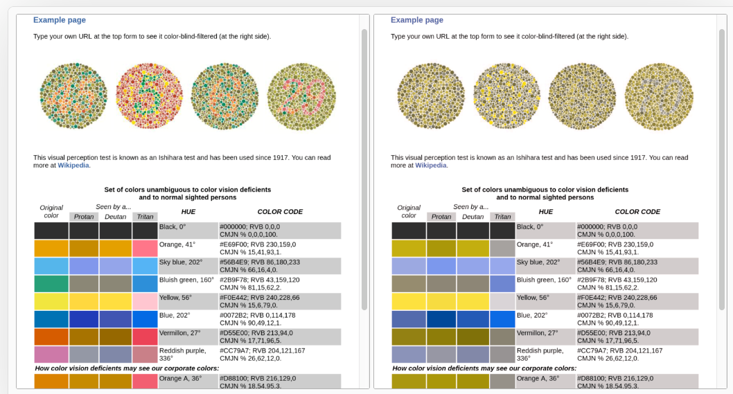
People with different degrees of colour blindness find it hard to differentiate similar colours such as red and orange, or green and blue. There are handy tools you can use to check how your website colours look to people with different types of colour blindness, such as the Toptal.com colour blind web page filter.

Test your website colours for how easy it is for colour blind people to use. Colour blindness checker from https://www.toptal.com/designers/colorfilter
To make your website colours easy to use, ideally:
- Use black writing on a white background for any large sections of text
- Use high contrast text (avoid yellow text on white, or blue text over an image of water)
- Avoid placing text over busy images
- Avoid graphic text with similar colours, such as red and orange together
By making your website enjoyable for everyone, you’ll keep your customers happy and snag those sales conversions.

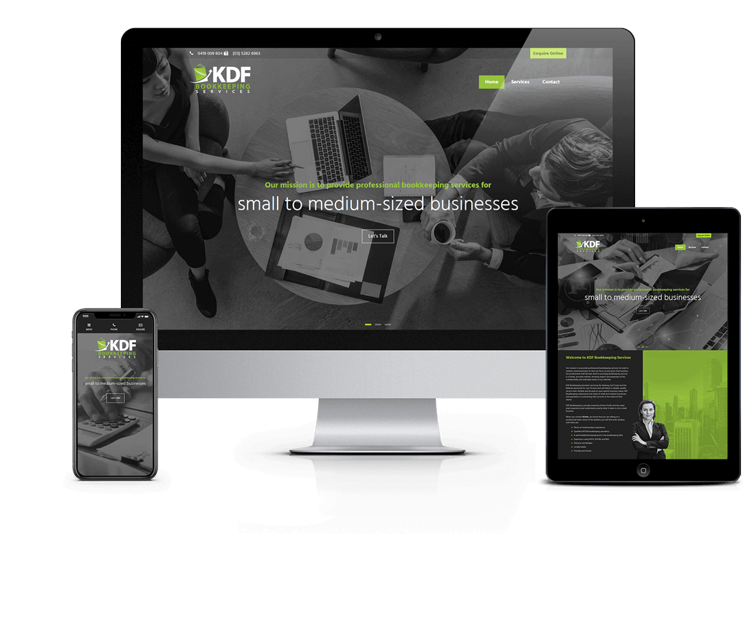
The responsive website design automatically adjusts itself to look good on desktop, tablet and mobile.
Mobile responsive design
What’s the first thing you do when you want to search for a product? Unless you happen to be already sitting at your computer, chances are you’ll whip out your phone and do a quick search. Most people start any searches on their mobile, and that’s why you must make your website mobile friendly, also known as a “responsive design”.
A mobile responsive website design means:
- Websites are easy to read on any size device
- The website design automatically adjusts itself to suit the device’s screen size
- Text is a readable size on the screen without manually adjusting the zoom
- Customers can easily touch buttons with their fingers
- The page loads quickly on a mobile data connection
- Ideally the page would load text first and images second
Check out our article all about responsive design here.
If your customers have to get up off the couch and switch to a desktop to make a purchase, you’ve lost them. So if you’ve got an eCommerce checkout integrated into your website, make sure it’s easy to use on a mobile and tablet.
Again, Google Analytics can give you insights into the activity of mobile users. If you find that your sales conversions are low on mobile, despite having lots of mobile visitors, there could be a problem with your mobile checkout process. Make your website mobile responsive and easy to checkout on a mobile, and you’ll increase sales, just like that!

Prominent buttons with clear calls to action make it easy for customers to take the next step in the sales process.
Calls to action and buttons
One of the simplest ways to improve your online sales is to include strong calls to action. This is where you specifically ask the customer to buy your product, or perform an action like sign up for a newsletter.
When you make it easy for a customer to see what they need to do next, they’re more likely to do it. But if they have to spend even a few seconds wondering “How can I get this?” it’s all too hard for them, and they’re gone.
To help customers buy from you, make the next step really obvious, and make it easy.
Good buttons ask for a specific action, and they’re quite short, such as:
- Add to cart
- Checkout now
- Learn more
- Get started
- Try [service] for free
- Free trial (no credit card required)
- Read next
- Get 10% off (or $ off) your first purchase
Choose some calls to action that are appropriate for your product or service, and try them on your website. Then track your conversion rate for those pages to see how much your sales improve.
You can test different button text to see which action your customers like best. In testing, you might find that your customers respond more often to Free trial (no credit card required) than to Try it for free. This may be because it eases their concerns about “is this free trial really free?”
For more ideas on writing strong calls to action, listen to this copywriting podcast with lots of useful tips to try on your website to help you increase sales.
Which tips can you include in your website?
Get started on assessing your current website on its usability. Chances are, you’ll find plenty of areas for improvement that you can change yourself, for free, like adding calls to action and using Google Analytics.
If you need help to improve your website design, or you’re ready to build a new user-friendly website, get in touch with our affordable website design experts on 1300 367 009. eCommerce-compatible websites start from just $1255.


